Brand Guidelines
Our Identity
These guidelines ensure M Sound Solutions looks and feels consistent across every touchpoint. Follow them to keep our brand sharp.
01 — Logo
Logo Usage
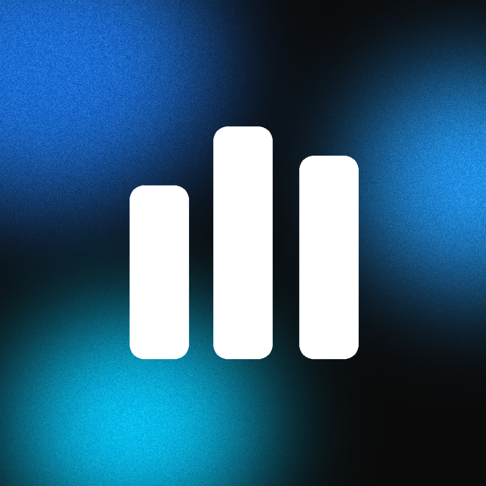
The M Sound icon represents equalizer bars — our core identity in audio. Use it consistently and with respect.
 White Logo — Dark Background
Dark Logo — Light Background
White Logo — On Gradient
White Logo — Dark Background
Dark Logo — Light Background
White Logo — On Gradient
Maintain at least 1× the icon width as clear space on all sides. No text, images or other elements should enter this zone.
24px digital
10mm print
Never display the icon smaller than 24px on screen or 10mm in print. Below this size, details become unclear.
Don't rotate or skew the logo
Don't alter colors outside the palette
Don't add drop shadows or effects
Don't stretch or distort proportions
02 — Colors
Color Palette
A dark-first palette with blue accents reflecting precision, technology and audio depth.
Blue Primary
#2196F3
Cyan Accent
#00C6FF
Deep Blue
#1A6DD4
Background
#0A0A0A
Surface
#111111
Elevated
#161616
Primary Text
#F0F0F0
Muted Text
#777777
Border Default
rgba(255,255,255,.12)
Border Hover
rgba(255,255,255,.28)
03 — Typography
Type System
Two weights from the Barlow family create contrast between bold headlines and readable body text.
Headings — Barlow Condensed
Used for all headings, labels, eyebrows and navigation. Always uppercase with tight tracking.
Body — Barlow
Used for paragraphs, descriptions and all body content. Sentence case with generous line-height for readability.
04 — UI Components
Design System
Core components that define our interface. Blocky, precise and intentional.
Solid blue (#2196F3) with cut-corner clip-path for primary. Transparent with border for ghost (no clip-path). Both use Barlow Condensed uppercase.
Card Title
Subtle hover state at rgba(255,255,255,.025).
No border-radius. Single-pixel borders. Dark background with elevated surface on hover.
Default — 12% white
Hover — 28% white
Always 1px solid. Used for section dividers, card outlines and grid structure.
Section Eyebrow
Muted Label
Eyebrows use cyan accent color. Muted labels for secondary context. Both use Barlow Condensed at .68–.72rem with wide tracking.
Square icon containers. 1px border. Stroke-based SVG icons preferred, 1.5–2px stroke width.
Semi-transparent dark background with border. Cyan text. Barlow Condensed at .65rem, uppercase.
05 — Voice & Tone
How We Speak
Our language is direct, confident and technical without being cold.
Professional
We know audio. Our expertise shows through clarity, not jargon.
Direct
Short sentences. Active voice. No fluff.
"Sound that moves the world."
Confident, bold headlines that speak to ambition. Body copy stays grounded and approachable.
Use exclamation marks excessively. Use buzzwords or hype language. Sound robotic or overly formal. Oversell — the product speaks for itself.
06 — Assets